User Guide
Welcome to the User Guide. This document offers a comprehensive overview of the application's core features, setup instructions, and best practices. Whether you're a first-time user or just need a quick refresher, this guide is designed to support you step by step.
Table of Contents
- 1. The Demand Forecasting Tool
- 2. The Optimiser Tool
- 3. Simulation Configuration Parameters
- 4. The Simulator
- 5. Results
- 6. Results Analysis
- 7. FAQ
1. The Demand Forecasting Tool
This section provides a quick overview to help you get started with the application.
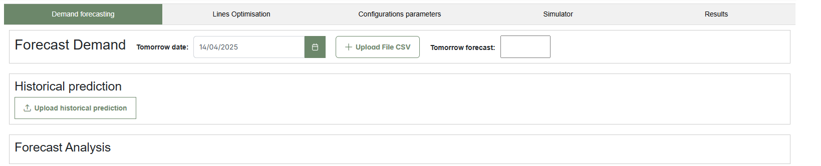
The figure above shows the initial interface of the Demand Forecasting tool. The entire interface includes several tabs: Demand Forecasting, Lines Optimisation, Configuration Parameters, Simulator, and Results.
1.1 How to Forecast Demand for Tomorrow Production
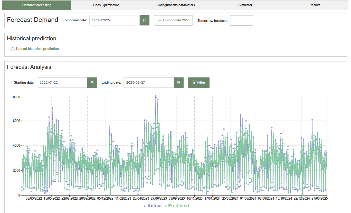
This tool allows users to forecast the next day production demand based on historical data. Follow the steps below to upload input data, generate a forecast, and visualize historical trends in an interactive chart.
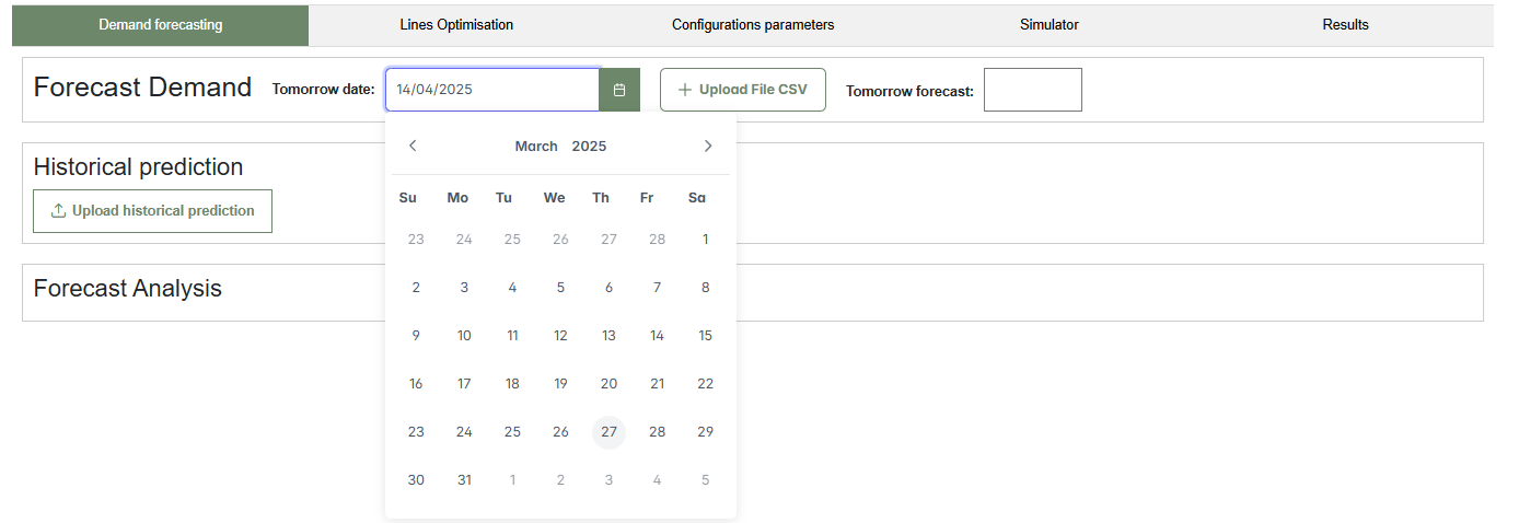
- Enter tomorrow date in the “Tomorrow date” field (e.g., 27/03/2025).(Clic the image below to reproduce the video)
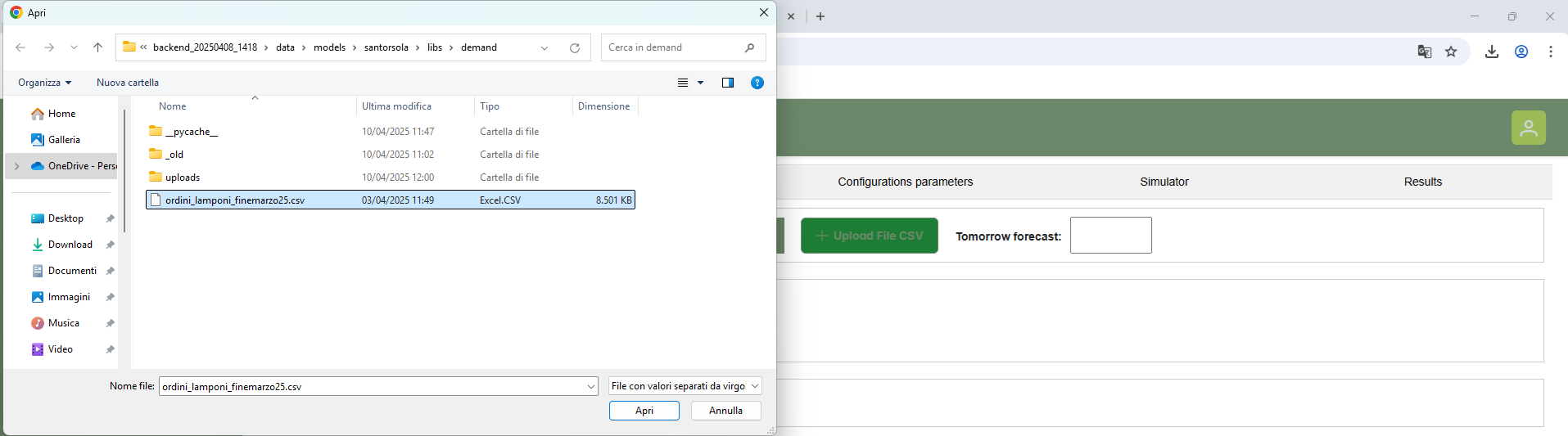
- Upload the required CSV file by clicking the “Upload a CSV file” button.
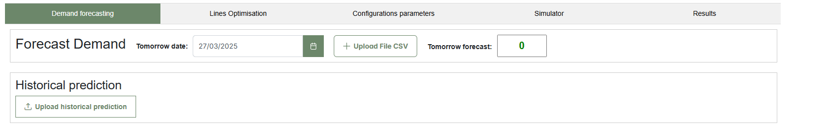
- Once the file and date are provided, wait for the forecast to be generated. The predicted value will automatically appear in the “Tomorrow forecast” box.(Clic the image below to reproduce the video)
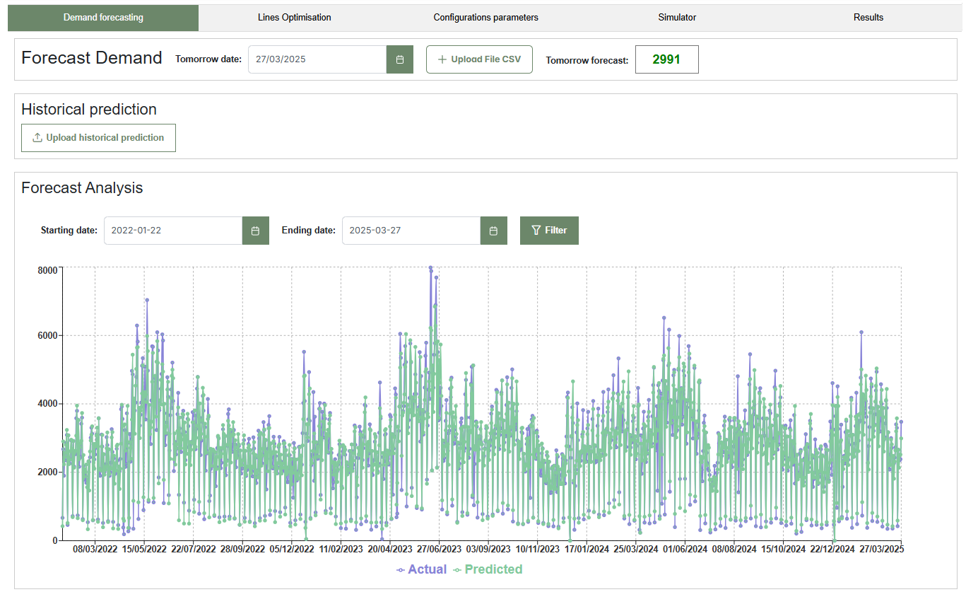
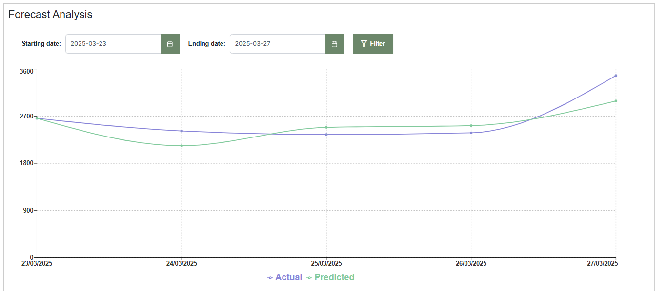
- After prediction, a chart displaying all historical forecasts will appear in the “Forecast Analysis” section.
- The chart ends with the most recent forecasted date. Use the available menus to filter and focus on a specific analysis period.(Clic the image below to reproduce the video)
1.2 Alternative access to forecast history:
Instead of generating a new forecast, you can click the “Upload historical prediction” button to view past demand forecasts. This allows exploration of the prediction chart without computing a new forecast.
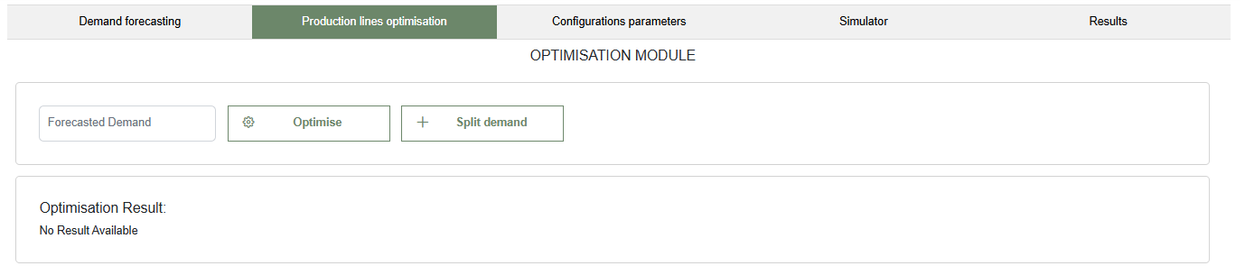
2. The Optimiser Tool
This section presents the Production Lines Optimisation interface, accessible under the "Production lines optimisation" tab. The module, titledOPTIMISATION MODULE, includes:
- An input field labeled Forecasted Demand, where users can manually enter or load the demand value. This field is connected to the Forecast Demand Tool but can also accept custom values.
- The Optimise button, which runs the optimisation process based on the entered demand and system configuration.
- The Split demand button, which allows users to segment demand across multiple periods or lines before running the optimisation.
If no optimisation has been performed, the "Optimisation Result" section remains empty with the message "No Result Available."
2.1 Optimising Production Lines with Forecasted Demand
In the example below, a forecasted demand of 5,000 units has been entered into the input field.

Clicking the Optimise button starts the process, assuming the entire demand must be produced by the end of the shift. Alternatively, the Split demand button can be used to distribute the workload before optimisation.
2.1.1 Using the Optimise Button
When the user directly clicks the Optimise button, the optimiser assigns the full production to available lines. The result shows which lines are active, the number of operators (combinations), working hours, and the number of crates assigned.
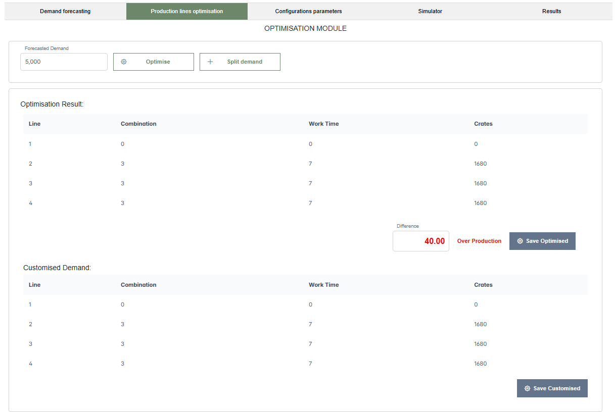
In the example, lines 2, 3, and 4 are active, each working 7 hours with combination 3, producing 1,680 crates each. Line 1 is inactive. The total output is 5,040 crates, exceeding the target by 40 crates, due to integer hour rounding in the optimisation logic.
The Customised Demand section below allows manual adjustments. In the customised plan, line 1 is activated for 6.25 hours (combination 3), producing 1,500 crates, while line 4 is deactivated. This removes the overproduction and aligns the output to exactly 5,000 crates.
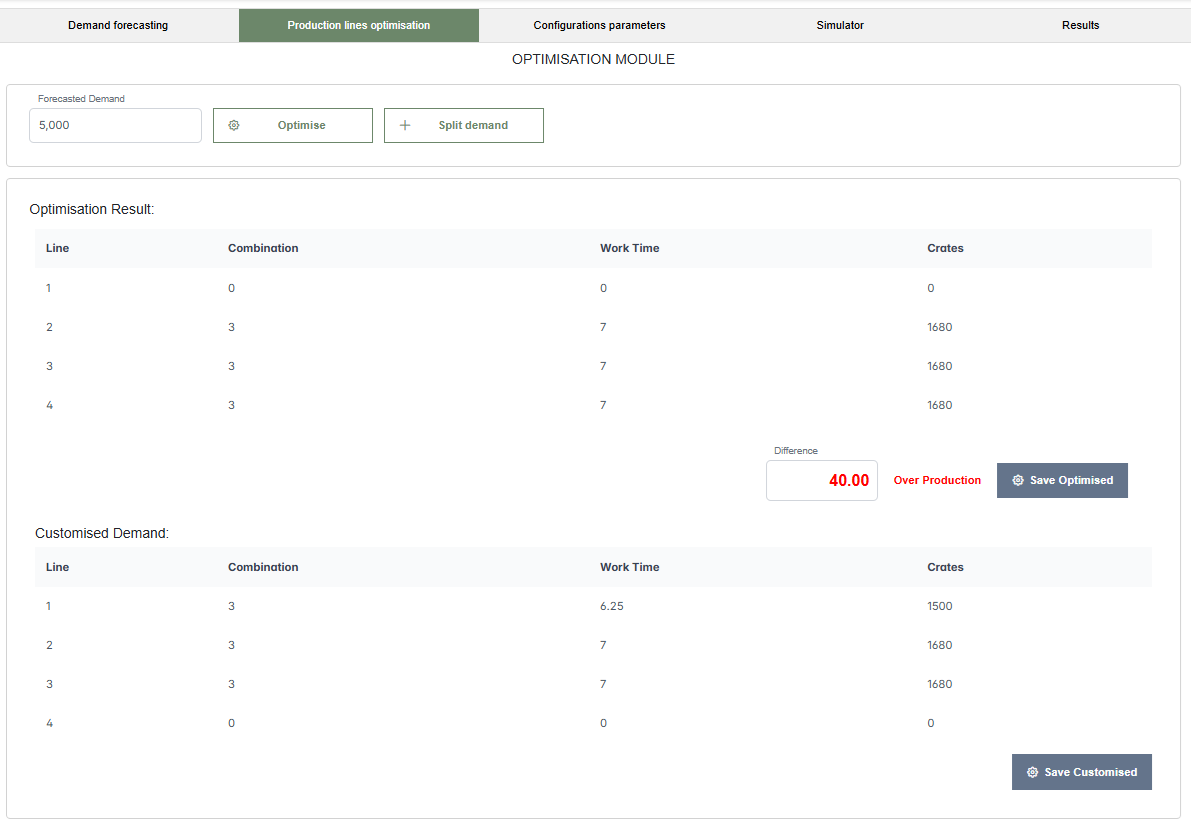
The user can then save either the optimised or the customised plan, which will be available for further use in the simulator.
2.1.2 Using the Split Demand Button
Clicking the Split demand button opens a modal window titled "Set the splitted demand", where the user can distribute the total demand across different periods (H1–H8). This allows for time-phased or shift-based planning.
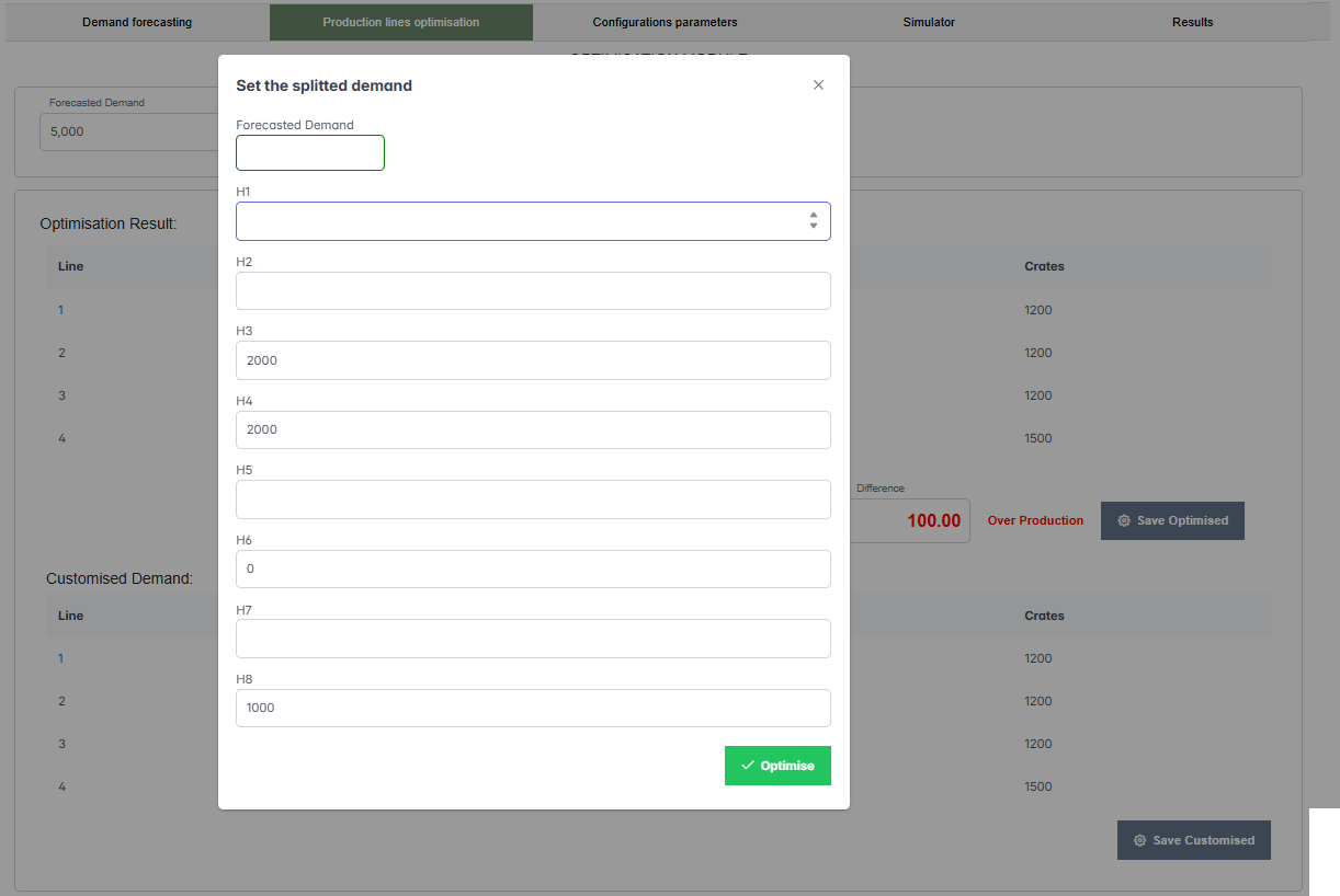
In the example shown, the user allocates 2,000 crates to H3, 2,000 to H4, and 1,000 to H8. After confirming, the optimiser processes the input according to the specified distribution.
The resulting optimisation, shown below, activates all four lines. Lines 1, 2, and 3 work 5 hours with combination 3, producing 1,200 crates each. Line 4 works with combination 4, also for 5 hours, producing 1,500 crates. The total is 5,100 crates, leading again to an overproduction of 100 crates.
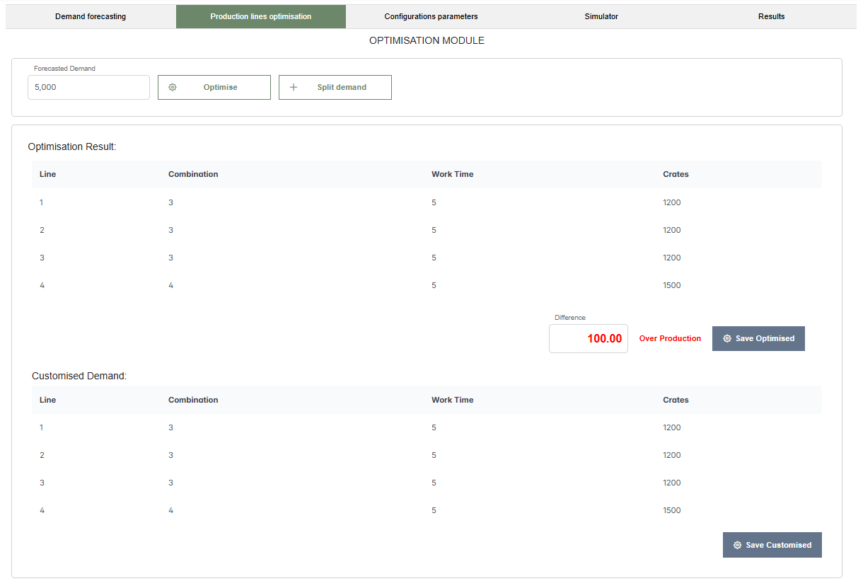
Although the final values are similar to the result obtained via direct optimisation, the key difference lies in the input method. In the first case, the optimiser distributed demand uniformly over the shift. In the second case, the user defined how the demand should be split, enabling more control over the production schedule and alignment with operational rhythms.
3. The Simulation Configuration Parameters Tool
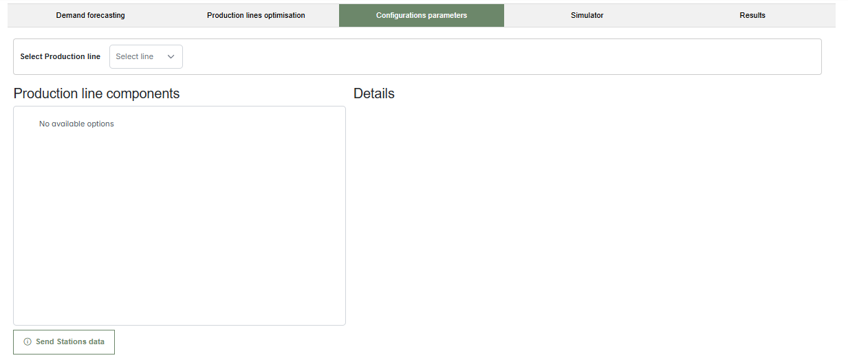
This section displays the Configurations Parameters interface, where users can define or view the structure of each production line. At the top, a dropdown menu labeled "Select Production line" allows the user to choose a specific line to configure.
Once a line is selected, the interface is divided into two areas:
- Production line components: a panel listing all stations that make up the selected production line. If no line is selected or no configuration exists yet, this panel remains empty.
- Details: a section that displays information related to the selected station, such as name and processing time.
- At the bottom, a button labeled "Send Stations data" allows the user to confirm and save the current configuration.
This interface is used to define the layout and behavior of each line before running simulations or optimisations.
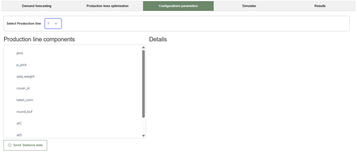
The next figure shows the interface after selecting Production line 1. The left panel is now populated with stations such as pick, p_pick, add_weight, cover_st, label_conv, round_buf, stC, and stD, outlining the sequence of tasks within the line.
The right-hand Details section is still empty at this stage but is designed to show configuration settings for any selected component. The Send Stations data button remains available to submit the configuration.
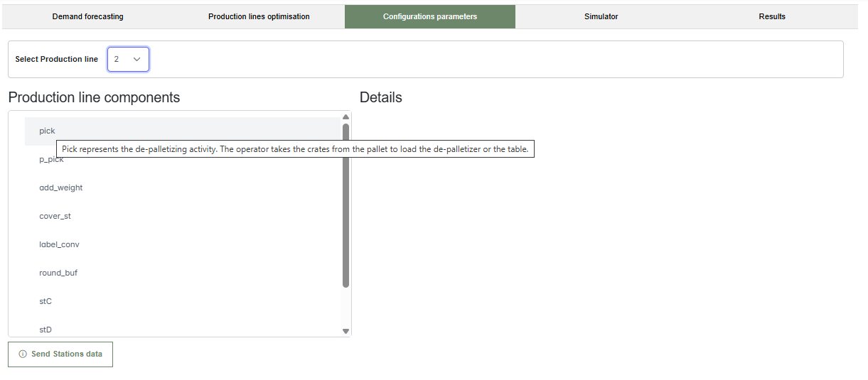
When hovering over a station—for example, pick—a tooltip appears with a useful description:"Pick represents the de-palletizing activity. The operator takes the crates from the pallet to load the de-palletizer or the table."
These contextual tooltips help users understand the role of each station, improving configuration accuracy and usability. The Details panel is ready to display more in-depth parameters when a component is selected.
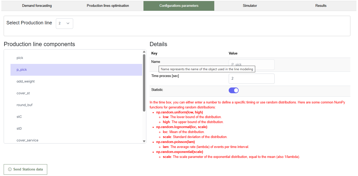
Once a component is selected, the right-hand Details section is populated with editable fields. Users can specify the component name and its processing time, either as a fixed value or using statistical parameters.
If statistical mode is enabled, a help section appears showing how to define processing times using random distributions, such as np.random.uniform(), np.random.lognormal(), or np.random.poisson(), making simulations more realistic.
After configuring the station, users can confirm and save the data using the Send Stations data button, ensuring the configuration is included in the upcoming simulation or optimisation process.

For example, as shown in the figure, once the p_pick component is selected, the right-hand section displays the component name, processing time, and the option to enable statistical mode. In this mode, users can define the duration using random distributions for more realistic simulations.
As before, as shown in this figure, when hovering over the Name input field, a tooltip appears explaining that this field refers to the identifier used for the object in the line modeling. This additional help ensures users correctly associate each station with its corresponding element in the simulation environment, avoiding mislabeling or inconsistencies in the setup.
4. The Simulator
This section illustrates the initial interface of the Simulator tab. The green highlight in the top menu indicates that the user is currently in the simulation environment of the application. The interface includes the following main elements:
- A toggle switch labeled View, which enables or disables the graphical representation of the simulation.
- A Play button (green arrow) to start the simulation and a Stop button (green square) to halt it.
- A numeric input labeled Repetitions, which defines how many times the simulation should run.
At this point, no simulation has started yet, and the controls are ready for user interaction.

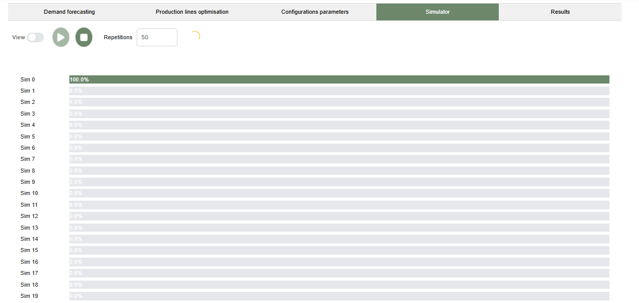
Multiple Simulations for Statistical Results
This image shows the simulation interface after pressing the Play button with the number of repetitions set to 50. A list of simulation instances is displayed on the left, labeled from Sim 0 to Sim 49 (only the first 20 are visible in the image). Each simulation has a progress bar showing its execution status. In this example, Sim 0 has completed (100%), while the others are pending at 0.0%. This layout allows users to monitor the progress of multiple runs in real time, which is essential for analyzing statistical variability and different production scenarios.
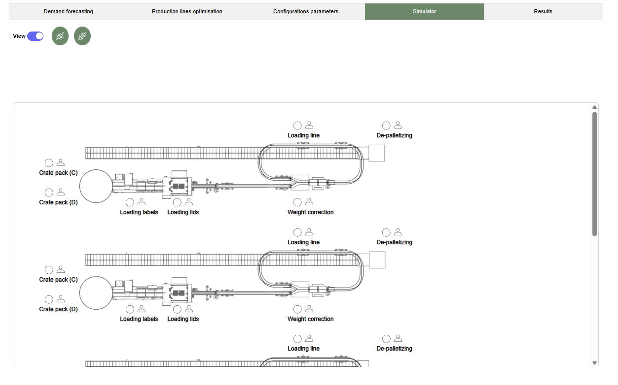
Graphical Simulation View
This image shows the interface after enabling the View toggle to activate graphical simulation mode. Once enabled, two additional buttons appear: Connect (middle button) and Disconnect (right button). To start the simulation in this mode, the user must first click Connect to establish communication with the simulation engine. Before closing the application, it's important to click Disconnect to safely terminate the connection and preserve simulation data integrity.

The simulation layout includes detailed representations of the production lines, with stations such as Crate pack (C), Loading labels, Weight correction, and De-palletizing. Visual symbols for operators are also shown, helping users understand the allocation of resources and the physical layout of each line. This graphical mode provides an intuitive and realistic visualization of the process, useful for validating the configuration and identifying potential inefficiencies.
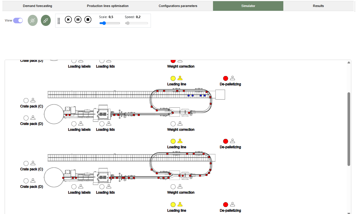
This final image shows the simulator in action with the View mode enabled. The simulation is actively running, as shown by the playback controls and animation across the production lines. Colored markers (e.g., red, yellow, blue) represent the state of crates and operations at different stages, such as Loading line, Weight correction, and De-palletizing. Controls at the top allow users to adjust simulation scale and speed, providing flexibility for observing detailed operations or speeding up the process for analysis. This dynamic visualization supports a clearer understanding of process performance in real time.
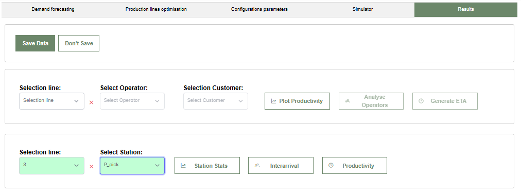
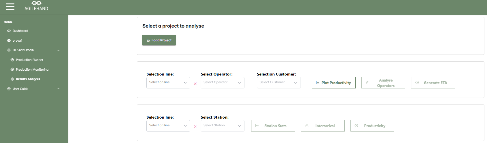
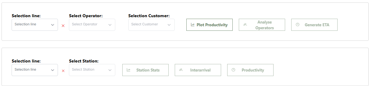
5. Results
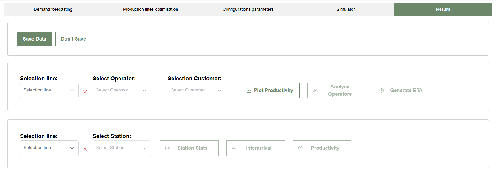
This image shows the initial interface of the Results tab. The section highlighted in green at the top confirms that the user is currently in the part dedicated to analyzing the simulation results. In this section, the operator can compare the expected demand with the production capacity, analyze the performance of operators and stations, and assess the order fulfillment times based on customers.
- Save Data - Save the obtained results for future analysis.
- Don't Save - Discard the results.
- Selection line - Select the production line from the available ones.
- Select Operator - Choose an operator or select "All" to include all operators.
- Select Customer - Choose the expected order arrival time for a specific customer.
- Plot Productivity - Generate a chart that compares the simulated productivity with the requested demand.
- Analyse Operators - Display a bar chart of the operators' workload.
- Generate ETA - Show the order fulfillment times based on customers.
- Select Station - Select a station assigned to the selected line or choose "All".
- Station Stats - Display a table with station statistics.
- Interarrival - Show the interarrival times of products at the station.
- Productivity - Display an hourly productivity bar chart for the station.
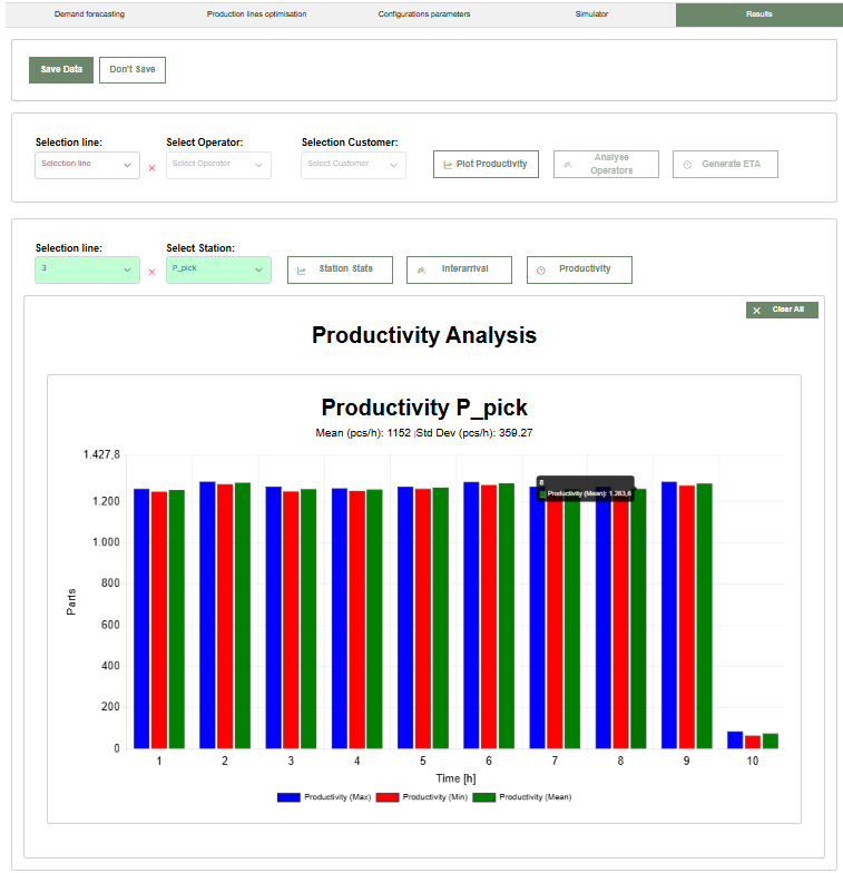
5.1 Productivity Analysis
This figure shows the chart comparing the simulated productivity with the requested demand after clicking the Plot Productivity button. In this example, the requested demand is distributed between the third, fifth, and eighth hours, with three curves representing simulated productivity (average in green, minimum in red, and maximum in blue). When hovering over a specific bar in the chart, a detailed summary for that point is displayed, including the maximum, minimum, and average values for that product.
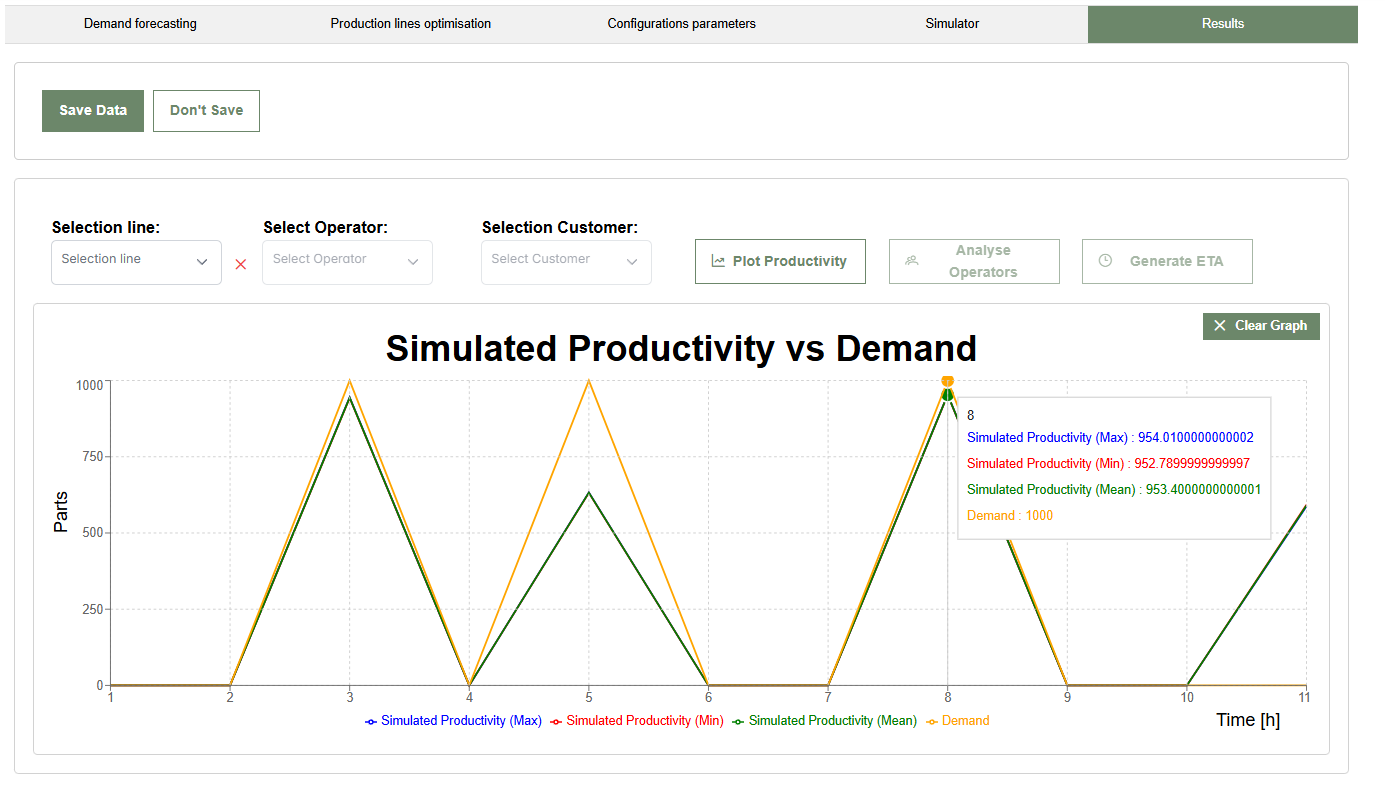
By clicking the Clear Graph button, the user can return to the initial screen of the Results tab.
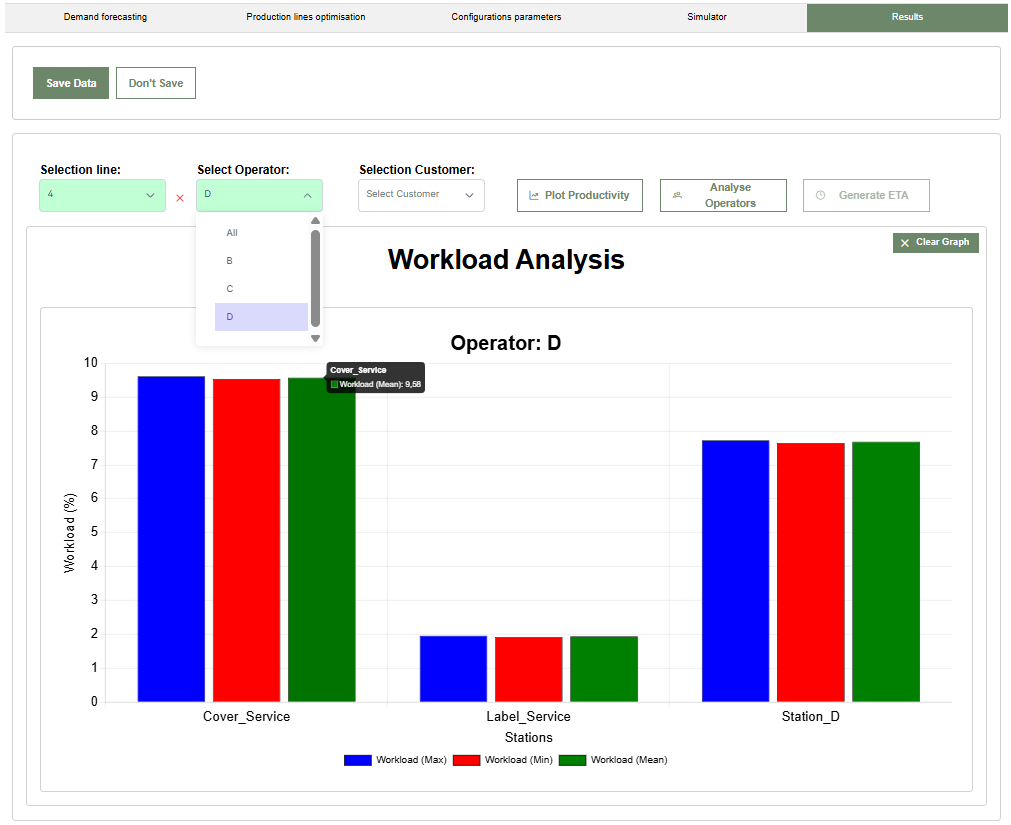
5.2 Operator Analysis
To view the operators' workload, select the desired line and operator first. Only then will the Analyse Operators button become enabled.
5.2.1 Single Operator Selection
In this example, Operator D of Line 4 was selected. The bar charts (average in green, minimum in red, and maximum in blue) show the operator's workload percentage at the assigned stations: Cover_Service, Label_Service, and Station_D. Hovering over a bar shows the workload percentage for that station.
5.2.2 Selecting "All"
In this case, selecting the All option in the operator dropdown shows the total workload percentages for each operator. Hovering over a bar shows the total workload percentage for that operator on the line.
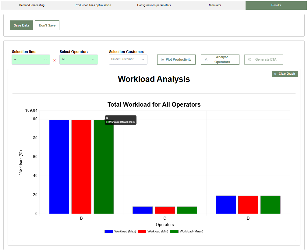
By clicking the Clear Graph button, the user can return to the initial screen of the Results tab.
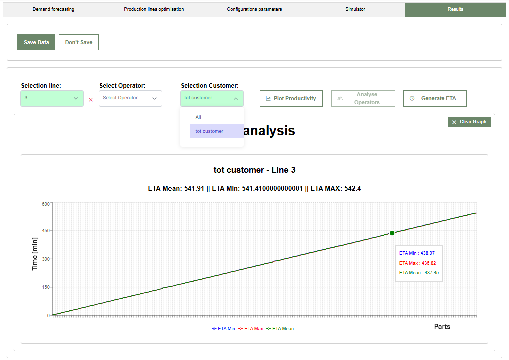
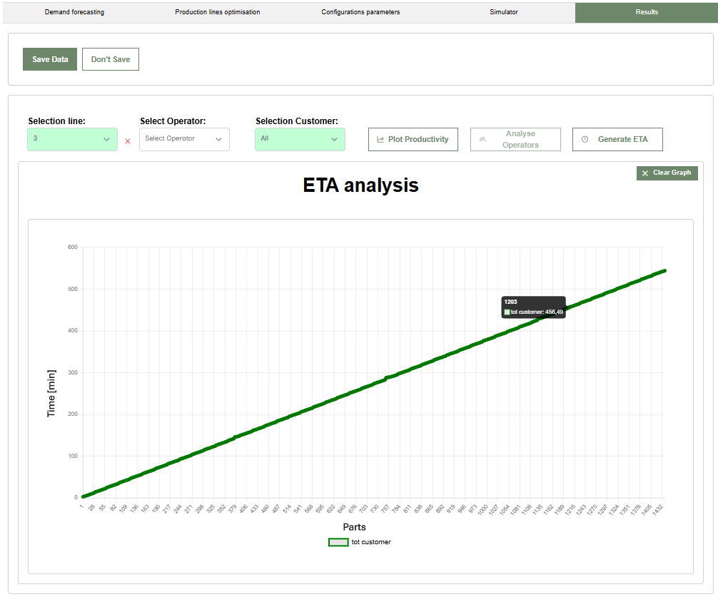
5.3 ETA Analysis
To view order fulfillment times, first select the line and then the customer. Only then will the Generate ETA button become enabled.
5.3.1 Single Customer Selection
This screen shows an analysis of the Estimated Time of Arrival (ETA) for a specific customer, in this case, tot customer related to Line 3. The lines show the order completion progress, indicating how production evolves over time to reach the customer's requested quantity. The lines represent ETA values (minimum in red, maximum in blue, and average in green).
5.3.2 Selecting "All"
In this example, the All option was selected in the customer dropdown. In this case, the average end-of-line arrival time for each product is shown, classified by customer.
By clicking the Clear Graph button, the user can return to the initial screen of the Results tab.
5.4 Station Analysis
The second area of the page allows you to select a line and a station. Only then will the Station Stats, Interarrival, and Productivity buttons become enabled.
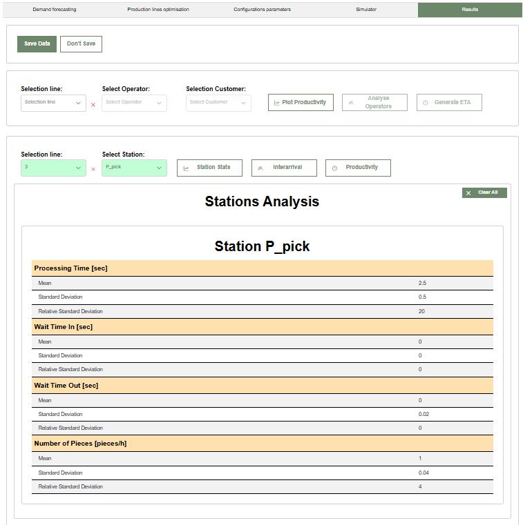
5.4.1 Station Statistics
This image shows the statistics for the workstation P-pick on Line 3. The report provides operational performance data for the station, including processing time, wait time in, wait time out, and the number of pieces processed per hour.
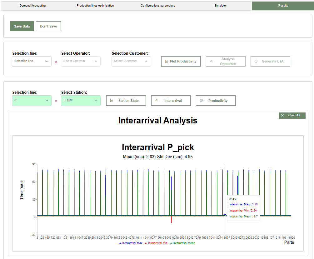
5.4.2 Interarrival
This screen shows the Interarrival analysis, monitoring the time between the arrival of one piece and the next.
5.4.3 Hourly Productivity
This section monitors the number of pieces produced per hour by the station, evaluating overall efficiency. The chart represents maximum, minimum, and average productivity values.
6. Results Analysis
From the main screen of the AgileHand dashboard, click on DT Sant'Osola in the left sidebar to open the dropdown menu. Select Results Analysis to access the analysis screen for previously saved simulations. In this section, click Load Project to upload the desired project. Once uploaded, compare the forecasted demand with the production capacity, analyze the performance of operators and stations, and evaluate order fulfillment times based on customer data.
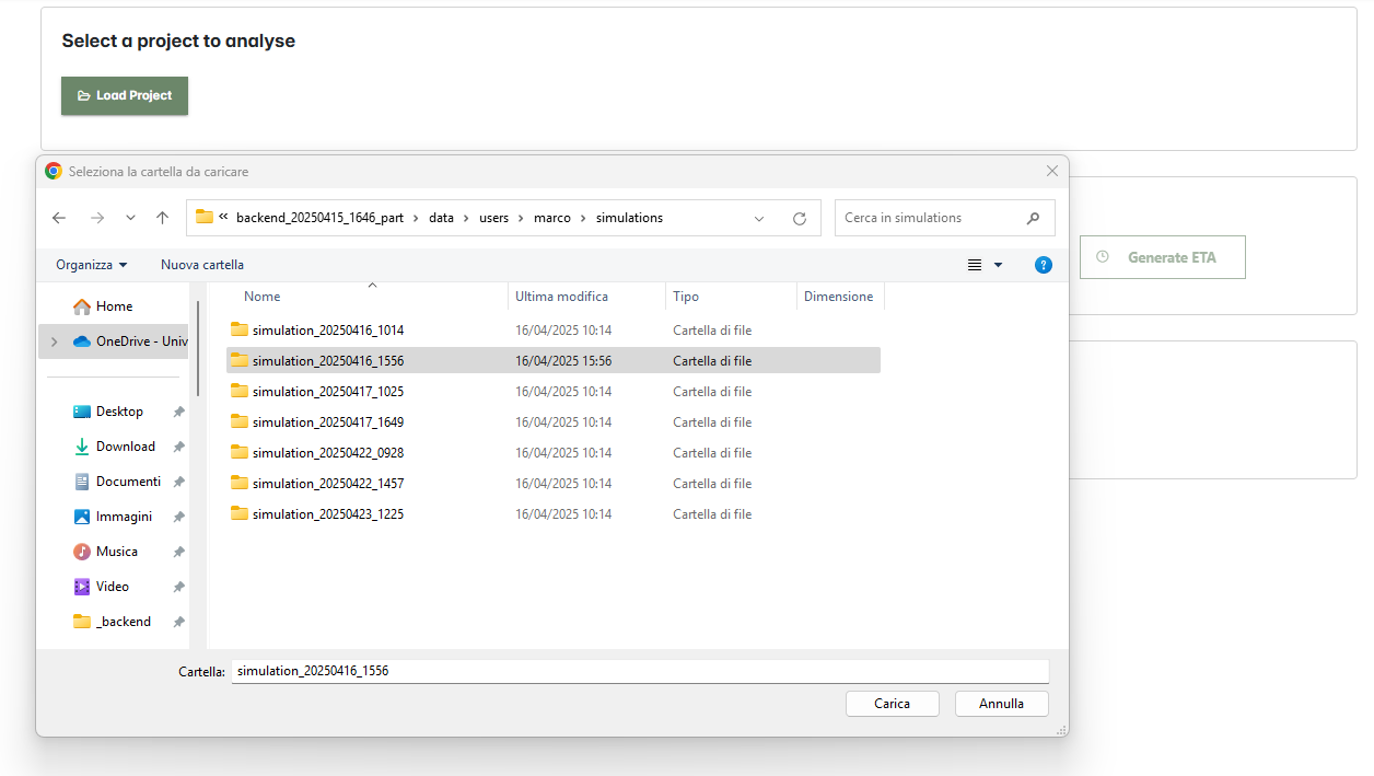
After clicking Load Project, a selection panel opens. It allows browsing through saved simulation folders. Select a folder to load the project into the platform for analysis.
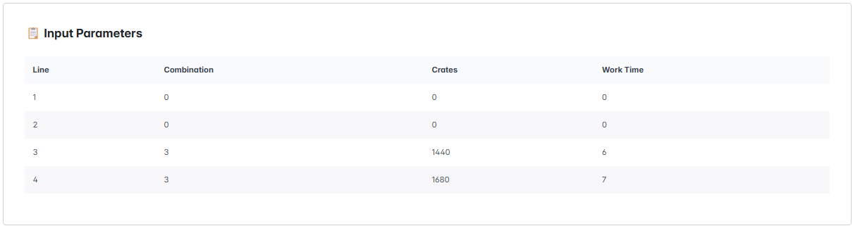
Once loaded, the production line configuration will appear in the Input Parameters section. This table provides the following information for each line:
- Line: The production line's identification number.
- Combination: The number of operators assigned to each line.
- Crates: The number of crates assigned to each line.
- Work Time: The working hours for each line.
With the simulation loaded and the line configuration visible, proceed to visualize all available results, as described in Section 5. Results. The operator can now analyze operator and station performance, compare demand and production capacity, and evaluate order fulfillment times for each customer.
Question?
If you have a question to ask, use the following link to send it to us. You will help us solve your issue and also build the FAQ section to support other users.
Submit your question